
How Cover Art Shapes the Sound

“Art is how we decorate space, music is how we decorate time.” -Jean-Michel Basquiat
We all know the age-old adage, “don’t judge a book by its cover.” But then again, to play devil’s advocate, doesn’t the cover of a book play a major role in piquing the reader’s interest? Covers aren’t as irrelevant as your grandmother, or other parental figure, may have had you believe when they waved their finger at you and tried to convince you to read some dusty old book with a boring cover. No, let’s face it: the cover is the first thing we see, the image that sticks with us, and colors our understanding of the book. And the exact same is true of album covers! Before a listener hears a single trumpet line or piano chord, the artwork already suggests a mood, a story, or even a musical philosophy. It hints at the tone of the album and quietly prepares the listener for what they’re about to hear.
So, why don’t we dive into some of the most iconic jazz album covers and take a look at what makes them so great?
Bird and Diz – Charlie Parker & Dizzy Gillespie
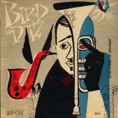
Did you know that the artist who made this cover, David Stone Martin, was one of the most prolific and iconic jazz album cover artists of the 20th century? He collaborated with countless jazz legends, such as Billie Holiday and Fred Astaire, to create over 400 covers that now evoke the mental image of mid-century jazz.
This specific album, released in 1952, captures the electric energy and exuberance between the dynamic duo of saxophonist Charlie Parker and trumpeter Dizzy Gillespie. The bold edges and selective use of color highlights the exhilarating improvisation of bebop. Martin used the crowquill ink pen to make delicate designs, such as the embellishments on the instruments. The imagery of the birds suggests to the listener that the instruments will seem to soar and fly away with the passion of the music on the ablum.
Time Out – Dave Brubeck Quartet
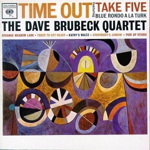
The abstract artwork on Time Out is a playful puzzle of colors and shapes, which is fitting, because the music inside the 1959 album experiments with rhythm in a similar way. The Dave Brubeck Quartet built the album around unusual time signatures like 5/4 and 9/8, which turned the rhythm into a kind of musical geometry that resembles the cover art. The bold, modernist cover hints that something innovative is happening within the grooves, and visually echoes the album’s adventurous spirit.
Bitches Brew – Miles Davis

The cover of Bitches Brew is an explosion of cosmic imagery, vibrant colors, dramatic landscapes and mysterious figures. Miles Davis’s previous album covers featured photographic portraits of the artist, so this surreal painting by Mati Klarwein was a big change. Before you even hear a single note, you already know this album will push boundaries and differ from Davis’s previous music. Bitches Brew fused jazz improvisation with electric instruments, rock energy, and studio experimentation to create a seminal landmark that influenced many musicians to come. The wild, psychedelic artwork prepares the listener for a sonic journey that is just as expansive and unpredictable.
Border Widow’s Lament – Bill Cunliffe, Martin Wind & Tim Horner

The cover of Border Widow’s Lament is a woman standing in front of what appears to be a sunrise or a sunset. She obscures the light with her dark silhouette, which, along with the melancholy title, suggests the experience of grief and pain. The border widow is a figure who has lost her beloved; whose sadness stands stark against the orange hues of the sky and the spindly tree branches in the background. Her grief is a powerful and potent force that defies the laws of nature. She exists in the liminal spaces, the borders and boundaries between night and day, life and death. Listeners will expect a deep musical experience that will allow for the catharsis of darker emotions.

The beautiful cover art for My Ship depicts a small blue sailboat amid the white of the blank canvas. In this interesting reversal, the ocean is white and the sailboat is blue, which is the opposite of what we would expect to see. And then the shore at the top is also blue brushes of paint instead of white sand. This unexpected shift sparks the listener’s imagination and makes one curious and wondrous. What other fun surprises might we expect to hear on this album?
Check out more compelling album art on Night is Alive’s albums page!
written by Jacqueline Knirnschild
photo by Pedro Netto on Unsplash


