The Art of the Album – How Design goes from Idea to Action

The Art of the Album Cover - From Idea to Action
My name is Benjamin, the creative director here at Night is Alive, and just one piece of a massive cog that tries daily to craft content for our fans and Jazz enthusiasts all across this massive globe we call Earth. My daily duties are usually things like making sure the website looks good and is working as it should, making sure the Social Media sites are unified and looking their best, and, most importantly, ensuring that all of our new music is getting into the hands of the folks who are looking for it.
That last step, marketing our albums, ties directly into my favorite part of this job: Working on Album designs!
It’s weird to think about, but in many cases, the album design is the first thing you’re interacting with you’re introduced to a new album – even before you hear the music itself, you’re looking at the social media post, the record or CD cover, and thinking, “hmm, is this album going to be worth my time?”
The process of designing how a new album will look is always tied to the story of the music. Every album has a story, or at the bare minimum, a feeling that can then be turned into a story. Our album Lovers and Love Songs was tied to a massive love story that had listeners playing along in a massive AR game that sent them across the US traveling to random websites, and real world locations, to figure out how the story ends. A few years later when we released Cryin’ in My Whiskey we leaned heavily on the old country tropes of cowboys reflecting on a lost love while walking down a sunset dirt road. The story is important.
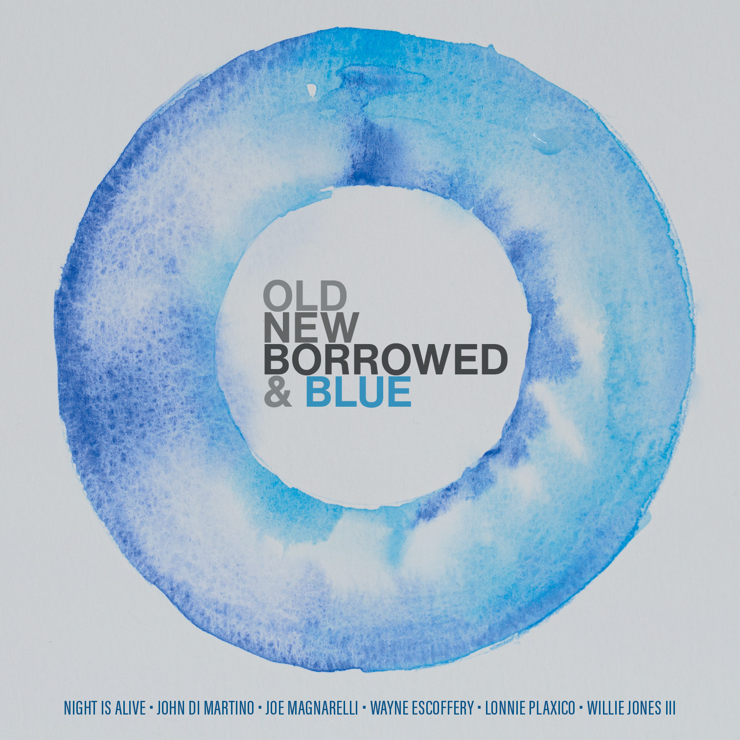
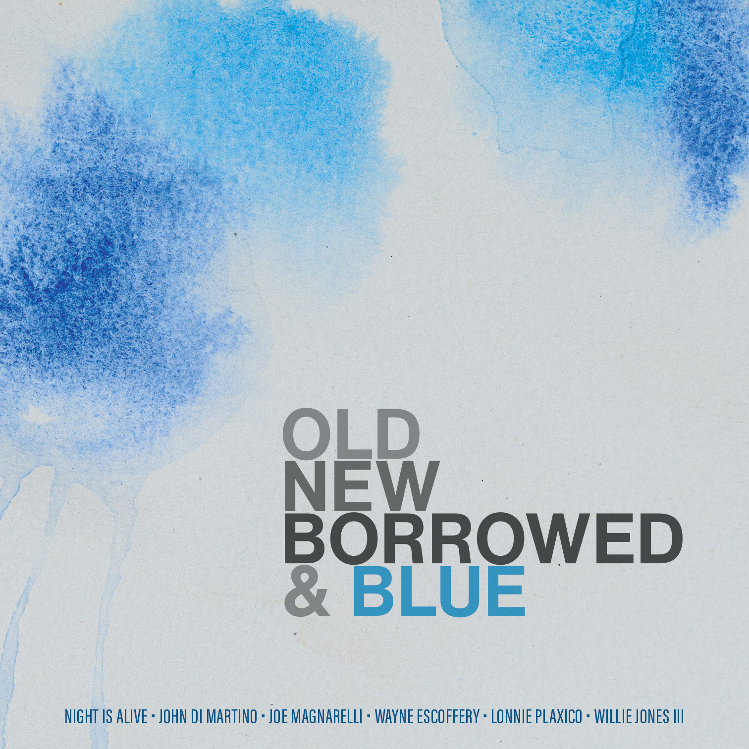
For Old New Borrowed and Blue we decided to let the color palette be the story. That may sound like a cop-out but here’s the thing. We, human beings, are very interesting and complicated creatures, especially when feelings are involved. There are ways that we can convey just a small part of an idea and you, the viewer’s mind, will fill in all of the blanks with a story that is unique to you. It’s like when you smell something you recognize from your past and suddenly your memory is flooded with moments that were locked behind the barriers of time. Colors, shapes, sounds, smells, tastes – all of these are tools to jumpstart your brain into weaving its own narrative.
Let’s start with the title of the Album: Old New Borrowed & Blue. Right off the bat we have 4 very strong descriptors to start from. Old and New sort of go together, so we should treat them as such. That brings our options down to 3. Borrowed is a fun idea with a great number of ways to evoke ideas of the past and interactions of taking and perhaps giving back. For this album, however, we decided to focus on Blue. Blue is great because it’s both figurative and literal. It’s a color, it’s a feeling, an emotion, a movement. In short, it was an easy choice to focus on this as our main story generation device.
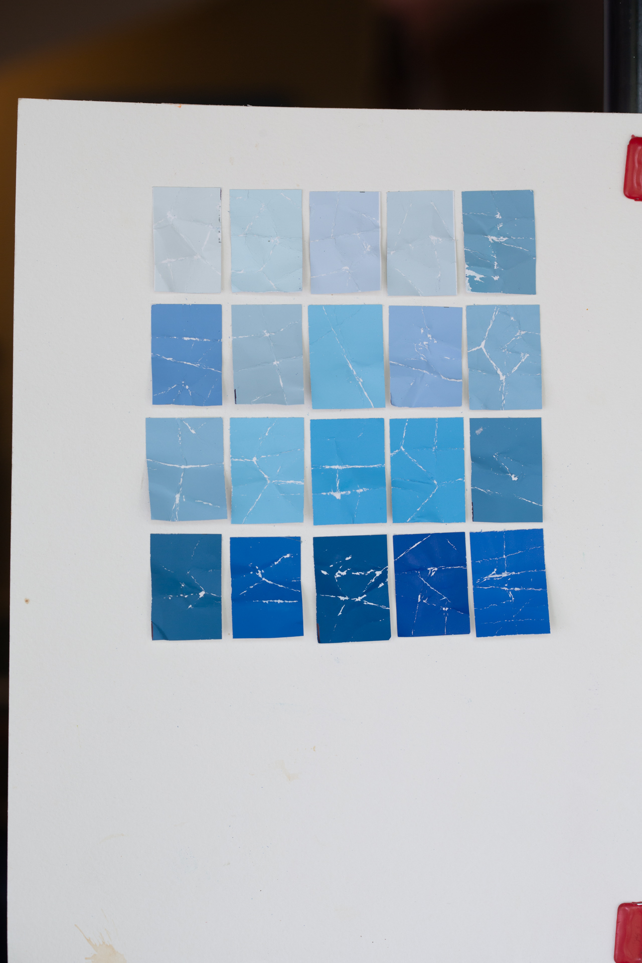
The next step is research. Jazz is about history. More specifically, it’s about Jazz’s own history. There aren’t many musical genres that hold themselves to major standards as much as Jazz does. With that in mind, we went through pretty much the entirety of Jazz’s historical music catalog looking for both places to take inspiration as well as places to veer off into new directions. Really quickly, I should mention, that even before I started the research phase I did have one possible idea: Go to the local home improvement store and just grab a ton of different shades of blue paint chips and then turn them into an almost “roofing tile” type of tactile artwork. I thought that would look cool and also have a neat 3D-ish look to it that would set it apart from the usual 2D look of nearly all other album artworks. Imagine my glee when I stumbled across Blue Note’s True Blue record and saw an obvious tie between their album design and my own idea! I realized this color watch idea would be a great homage to an epic album.
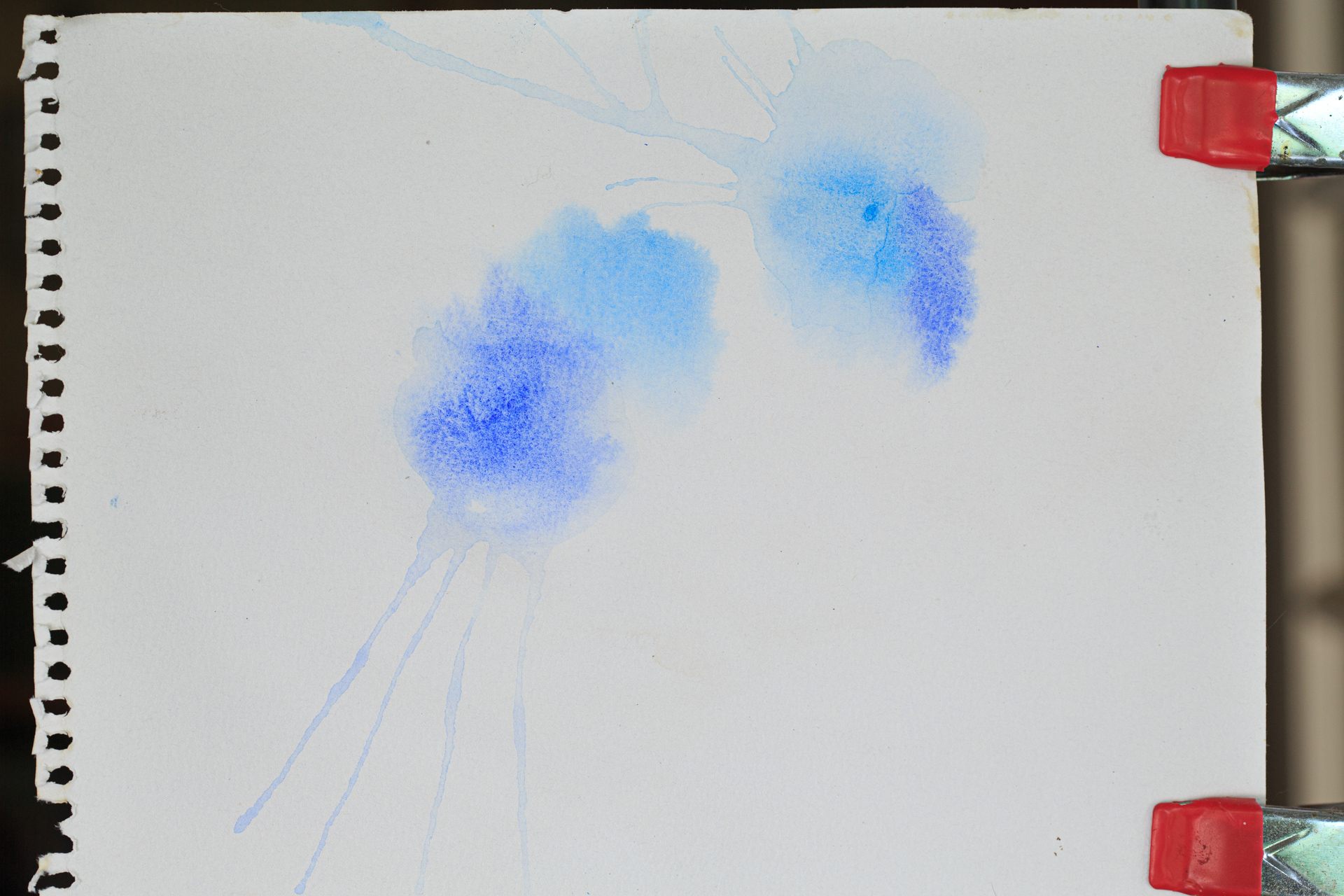
We can’t stop there though. So far, we have one idea ready to go, but in this modern age of digital consumption, it’s a good idea to have several designs ready for the myriad uses the internet and social media offer its users. I came up with two other ideas that relied on the color blue in the abstract. One would be a simple watercolor where we just let several hues of blue mix on wet paper, and the second would be a similar watercolor technique, only contained into a shape. The final idea is to use all three designs as interchangeable “cover art”. Again, this approach lets us swap out to a fresh design whenever we want and helps keep the marketing from getting visually stale too quickly.
Below are the photos of each design in its raw form.
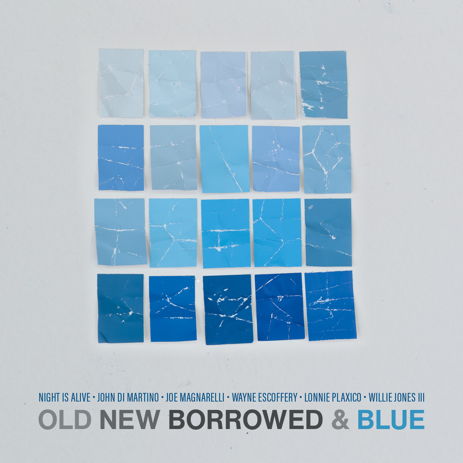
And here are the those pieces of artwork placed into their final designs.
We’ve chosen Helvetica Now as our font. The reasons are simple: Helvetica is absolutely timeless and can fit seamlessly into so many different types of design. We color it to match our title theme and viola! We’re done!
The next part of the puzzle is wrapping this design around album packaging and putting it in front of the fans!

Benjamin Lehman
Benjamin Lehman is a creative director and photographer from San Francisco who now calls the eastern side of the US his home. He has worked on projects both large and small with clients that include, Apple, Microsoft, Cisco, Netgear, LA Lakers, LA Kings, Facebook, Night is Alive, and so many more!